I’ve been reviewing consumer and mobile products for over 20 years. I’m bringing my experience and trained eye to this roundup of mobile furniture store apps. While many of the apps in this roundup offer an AR view in-room experience, it’s clear that the small screens can only provide so much. Still, my team and I tested all the features in these apps, created accounts, and kicked their tires.
Top 10 mobile furniture apps reviewed:
Why review mobile furniture apps?
As more furniture retailers turn to web-based AR to deliver a rich, interactive experience to their customers, the apps become less important—especially when dealing with large-scale items for the home. Viewing furniture on the web on a larger screen, such as a computer or tablet, becomes a more fulfilling experience.
Still, mobile furniture apps have their advantages. They are great for scanning products and adding to a cart while in a store and sharing product detail pages with others. And, of course, the in-app loyalty discounts are always welcome when buying big-ticket items. In many cases, while AR in mobile shopping apps is nice, it isn’t easy for consumers to picture how a couch will look in their living room. That said, using AR to place furniture in a space is a great tool for seeing what colors or fabrics would work in an existing room.
How we tested mobile furniture apps
We downloaded all of the apps on an Apple iPhone running iOS 16.6.1. We went through all the welcome screens and prompts to enter a location. You’d be surprised how many apps required that information, especially if we weren’t providing access to our location. We created accounts and interacted with all the icons on the top and bottom of the display.
We selected multiple products from every category and followed the prompts on a product detail page. For example, if it said View in 3D, we viewed in 3D. If it said Share, we shared. If it said, Check out similar items, we checked out similar items. You get the gist. Were we tempted to buy a new rug after spending time on these apps? Of course! Did we? No, because then we would have to buy an item from all the apps to review the checkout experience. Our scope was to see how well the app worked overall and what the interaction was like.
Some apps had more to offer, and some executed better than others. That’s why we listed the apps in the order of most impressive to least impressive. The apps that had AR and 3D features tended to rank first because they delivered a more interesting experience.
Ashley Home Furniture mobile app
Ashely furniture stores can be found worldwide, and as such, the mobile app (iOS and Android) focuses on tailoring the experience to your location. Its standout features include a clean layout and advanced features like Visual Search and View in Home.

Pros:
- Easy to navigate
- Delivery status
- Snap a picture of the product in a room and share it
- Add to cart from AR view
Cons:
- Requires a zip code to enter the site
- Can’t rotate an image in AR view
Features:
- Visual search
- Shop in app
- Delivery status
- Check on financing
- View in a room with AR
- Multiple product images
- Access account online
- Favorites
Categories: Furniture and décor for inside and outside the home
When you first open the app, it asks you to provide location information to show you items available at nearby stores. Even if you opt not to allow access to your location, you still need to enter a zip code before being allowed to enter the site. Presumably, this feature is designed to deliver a better shopping experience, only showing items you can get in your area.
Once in, the app highlights the ability to filter products you can see in your home using AR. The top nav has a search bar with a camera for Visual Search (more on that below), a notifications icon, and the shopping cart. We appreciated the back button next to the search bar since it made it easier to navigate the app.
Scroll down, and there are ads, financing info, product highlights, a list of local stores, access to your favorite shopping list (Favelist), customer service, tracking info for deliveries, and a few more product categories. The bottom navigation features icons for shop, store, home, and chat, and a menu that takes you to your account page to track information about deliveries, financing, alerts, what’s in your cart, and, of course, the nearest Ashley brick-and-mortar store.
Clicking on Shop will take you to an overview of departments (living room, bedroom, dining, mattresses, baby + toddler, outdoor, décor + pillows, rugs, organization, holiday, inspiration, home office, and deals.) Click one, and you’ll find a list of product categories. Click again to see a list of products with an image, name, rating, and price. If the product supports AR, you’ll also see a 3D square on the product tile. Like other furniture shopping apps, each product detail page has multiple images, share button, shipping details, specs, reviews, available colors, support buttons, favorite, and add to cart.
Visual search and AR
As mentioned above, a Visual Search feature allows you to take a picture (after you allow access to your camera) of furniture you like. The app will then populate a list of similar items available at Ashley. You can click to learn more about the product and add it to your Favelist or cart. The app tries to deliver similar products; however, it seems to focus more on related items or what you’d find in a type of room (bedroom, living room, etc.). For example, when we took a picture of a storage cabinet in an office, it returned some bedroom furniture. Similarly, when we snapped an armchair, it did show a chair but then went on to show us rugs and dining room sets.
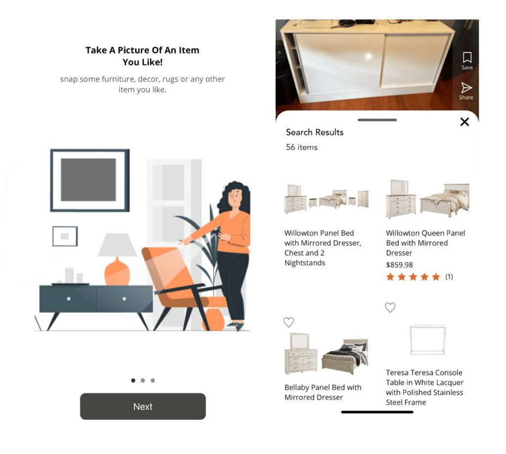
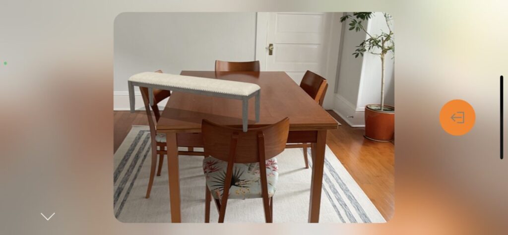
The View in Home AR feature is straightforward. Click the View in Home button, stand in the room where you want to add the product, and click the spinning ball when you know where you want to place it. It will appear in the room. Even though we could resize the image, we couldn’t rotate it. At this point, a product tile will appear, allowing you to click to buy. When you click the camera button, it snaps a picture you can share the way you would with any photo you snapped with your phone’s camera.

Final takeaway for Ashley Home Furniture mobile App:
We appreciated the clean interface and overall organization of the Ashley Furniture mobile app. It was easy to navigate. The visual search needs a little work on the types of products it returns, but the AR experience was as good as can be expected. Although you need to enter a zip code before gaining access to the site, that action makes sense for a global brand.
#2 Ikea Place app (listed as Ikea in the app store)
The Ikea Place app (iOS and Android) is like the company’s stores: an overwhelming amount of goods to explore presented in an uncluttered view. The app stays true to Ikea’s do-it-yourself roots by including an interactive 3D design tool.

Pros:
- Create 3D renderings using your space or existing rooms
- In-store barcode scanner and checkout feature
- Favorites and lists
Cons:
- Need to create an account to use the room scans you create
- Inspirational rooms have highlighted only a few items
Features:
- 3D renderings (existing and upload available)
- Shop in app
- Access account online
- Barcode scanner
Categories: Everything for inside and outside the home
Reach: International
The Ikea Place app has all the standard features you’d expect to find in a shopping app. The company’s offerings include just about everything you need for inside and outside the home. Pick your country, language, and local store, then peruse and search product cards with details, available colors, images of items alone and in a room, and pricing. Navigating the app is simple. The top nav bar includes icons for login/account, notifications, and the option to find something new or visit your inspirations (more on that below in Ikea Kreativ.) On the bottom of the app screen, there’s a home button, search, store for shopping, favorites, and cart. Both the search and store screens sport a barcode scanner that you can use in a store to add items to your cart seamlessly.
There are multiple ways to shop by room (inspirational and functional), style (modern to cozy) category (from furniture type to pet supplies to smart home), filters, and the ability to view and interact with a digital catalog. Creating an account is a straightforward experience, though we would prefer not to enter a birthdate. Then you can favorite items and save lists of things you find online or in the store.
3D Rendering almost on steroids
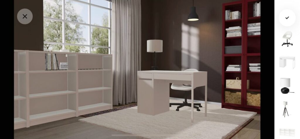
The app’s star is Ikea Kreativ, an interactive room design experience. There are two ways to create a room in the app: Upload an image of your space, and the app will create a 3D rendering, or use one of the inspiration rooms. If you’re using one of Ikea’s inspiration rooms, you’re stuck with the layout provided and usually a stationary item like a bookcase or rug you can design over but not remove. Either way, you must create an account to save and use the feature. Once you create an account and 3D rendering you can work on the design on the app or the web.
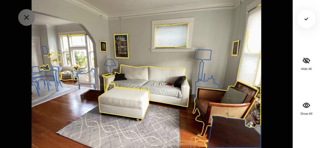
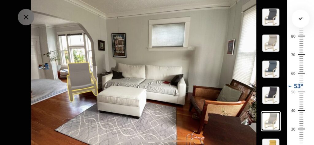
The app walks you through every step necessary to create a 3D rendering of your space. Once you enter the experience, the phone orientation changes to landscape and prompts you to stand in an area of the room that provides a good angle of the space. Snap a photo of your project space and approve the photo, or retake it. When you’re happy with an image of the room, the app instructs you to line up the photo with the live view of the room. Follow the infinity loop overlay to complete the 3D scan of the room. In minutes, a 3D render of the room appears, and you can delete items from the image and place new ones. You’ll also receive a link to your 3D room via email.
Adding, removing, and moving items around the rooms are similar in both 3D rendering options and are pretty intuitive. There are a few hiccups here and there. For example, we couldn’t rotate a rug that we added to the room we uploaded. The app creates a list of furniture you add to the room and provides a running total of everything you’ve picked. You can add the entire room or individual items to your cart in one click.
Final takeaway for Ikea Place app:
Overall, the Ikea Place app works well and provides prompts at the right times to get users on their way. The 3D experience could be a bit smoother, but it does a good enough job for customers to know how to place furniture in a room. Anyone who has walked through the labyrinth of an Ikea store will likely appreciate the app’s ability to scan and add to the cart while shopping.
#3 Crate & Barrel mobile app
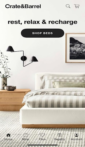
The Crate & Barrel app (only available for iOS) looks more polished than other apps in this roundup, thanks to the photography and short videos on its home page. Some items support the AR view in a room feature, but there’s no easy way to figure out which ones.
Pros:
- Registry
- Favorites
- Barcode scanning for shopping in-store
- Excellent AR experience
Cons:
- No app for Android
- Need to add contact information for gift registry even after creating an account
Features:
- Shop in app
- Multiple product images
- Access account online
- Favorites & Lists
- In-app discounts
- Registry
- Personalize shopping with an account
- AR view in room
- Exclusive items
Categories: Furniture and décor for inside and outside the home, and small kitchen appliances
The first thing you notice about the Crate & Barrel app is that it feels like you’re looking at one of its catalogs. Scroll up and down on the home page to find the category you want: sale items, outdoor furniture, sofas, new arrivals, collections, beds, book a design appointment, bedding, seasonal, rugs, dining, dinnerware, small appliances, kitchen goods, kids, and more. Whatever option you pick drops you right into items related to that category. You can also tap any icon at the top (search and cart) and bottom (home, shop, favs, registry, and account) to enter the mobile app and start shopping. Once in the app, the top nav includes buttons for sorting and filtering, ready to ship and ship within four weeks to help narrow your choice.
In the catalog view, you can see product images, pricing info, and if it’s a new arrival or on sale. And you can favorite it and save it to a list. You do have to create an account if you want to create and save items to your list. In addition to everything you see on the catalog listing, the product page has more images, reviews, available colors, options, shipping information, product details, items to pair it with, and other goods in a collection, people also viewed, and add to cart. If you’re shopping in the store, click the search bar, and you’ll have an option to scan a barcode.
Signing up for gifts
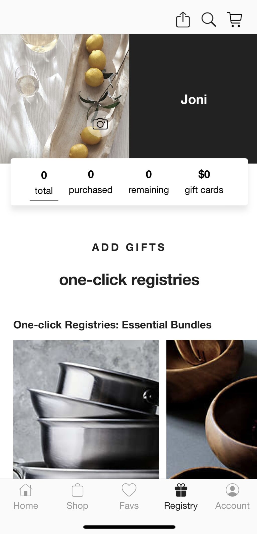
You’ll need to create an account (Apple ID, Google ID, or create a new one) to access this feature. The app walks you through each step: select a category, add contact information, add co-registrant, provide event details (date and number of guests), confirm where to ship items, location details, preferred store, and preferences. While the steps are clear, we found a few redundant things to complete. Once in the registry, you can click on an item to view the product detail page or the plus icon on a listed product to add it to a registry. These same options now appear throughout the app.
Picture it: furniture in a room
As mentioned, you can view some products in your home. The Crate & Barrel app offered the most control placing items in a room. For example, we picked a side table and placed it exactly where it should go in a room, so we really could visualize how it might look with our existing furniture.
Products that support this feature have a View in Your Room button on the image on the detail page. Click it, and instructions will appear on the screen to help you place the item in your room. Once you have moved the phone to the right location, click the item on the phone. Then, you can resize it and put it in place.

Final takeaway for Crate & Barrel mobile app:
Thanks to its photography and clean layout, the Crate & Barrel mobile app is one of the better-looking apps in this roundup. Navigation is straightforward and the AR experience worked exactly as expected. The only real bummer is that the Crate & Barrel app doesn’t offer an Android version.
#4 Bob’s Discount Furniture mobile app
The mobile app (iOS and Android) for Bob’s Discount Furniture has all the features you’d expect from a furniture app, plus the ability to view some of the products in a room to see how they might look with your décor. The app is straightforward and easy to navigate, and you can always find help if you have a question.
Pros:
- See what products look good in your home
- In-store barcode scanner
- Easily add more products to a room
- 360-degree views
- Favorites and lists
Cons:
- AR feature found on product detail pages is hit or miss
Features:
- AR renderings
- Shop in app
- See in your room
- 360-degree views
- Access account online
- Barcode scanner
Categories: Furniture and décor for inside and outside the home
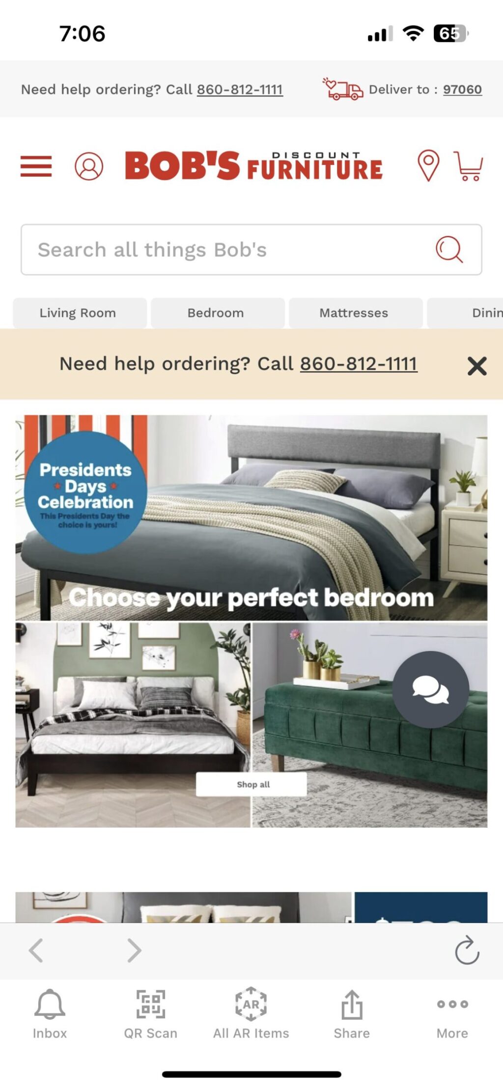
The first thing you notice when opening Bob’s Discount Furniture app is that help is always nearby, whether you want to call to place an order (they have a phone number at the top of the screen) or just want to chat online. A chat icon stays stationary in the lower right corner regardless of scrolling up, down, or side-to-side.
The app is extremely straightforward and displays the vast inventory in a clean and organized design, making it easy to find what you want through multiple entry points (product category or room). To find what you’re looking for, use the search bar at the top of the screen or browse by room/use: living room, home décor, dining room, home office, mattresses, bed pillows, bedding, and outdoor. You can also go directly to the product category and filter products by style, finish, material, features, type of product, and how you view the products in the app.
Product listings include star ratings, pictures, prices, and available colors. Expanded listings sport everything on the thumbnail and more images from multiple angles (including the item placed in a room) and dimensions. You can add the item to your cart or share it with others (on Pinterest or copy the link and send it to a friend).
We appreciated the inclusion of a QR code scanner for use in the store. You can favorite items, add them to a wish list, and add them to your cart. For any account information you set up, you can designate preferences and track an order or all located under the More menu.
Exploring AR & 360-degree views
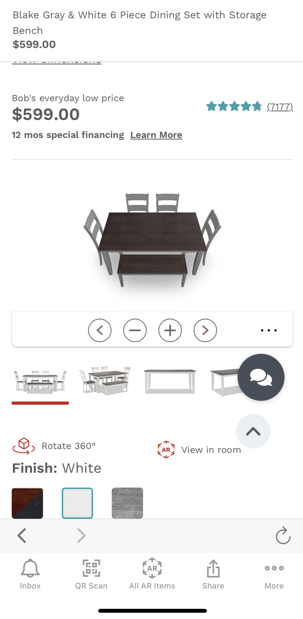
In the top right corner of the product detail page sits an icon of four arrows pointing out. It leads you to the AR experience. While this icon appears on many product pages, they don’t all support the AR experience. Clicking the All AR Items icon in the middle of the bottom nav bar will load a list of products (beds, sofas, dining sets, etc.) that support the feature.
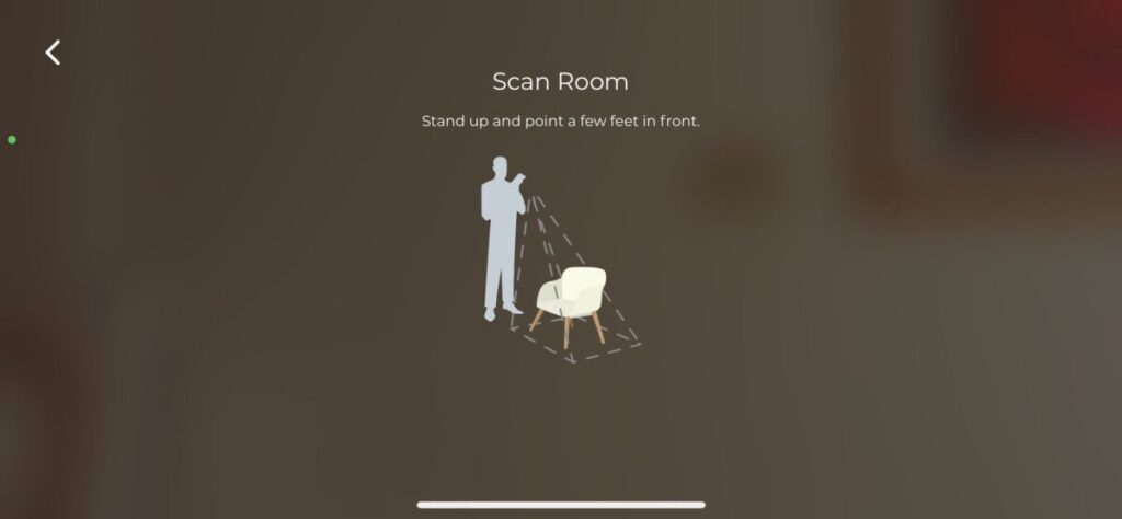
The View in Room experience is straightforward but a bit slow. We were never entirely sure if the app registered that we were following the instructions. Some sort of message or ticking clock would have been useful. When you select View in the Room, it prompts you to access your camera and point it in a direction in the room. This step takes at least a minute.
Once a white bar appears, text instructs you to place the furniture in the room. Here, you can play with scale and move the furniture around your room. Since we were looking at a sofa, turning the phone horizontal was a much better experience.
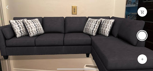
If you like what you see, you can add it to your cart with just one click. You can also click Add Items to Your Space, pick a category, and select a product. That item will appear in the space, and you can move it around and resize it.
Some products also have a 360-degree option that works quite well, so you can see the product from multiple angles. Click the image, and a loading bar appears on the screen. Then, the item appears with navigation arrows so you can turn the item at will.
Final takeaway for Bob’s Discount Furniture app:
The app has everything a furniture shopper wants and a few nice extras (easy to share with a friend, AR, and 360-degree views). The only confusion comes when clicking on the AR icon on a product detail page and it’s not supported by that feature.
#5 Wayfair mobile app
Wayfair is one of the largest home goods retailers, and you can find all that inventory on its mobile app (iOS and Android). If you’re comfortable shopping on the company’s website, you’ll feel right at home using its app.
Pros:
- Helpful videos that show off products
- Favorites and lists
- Tons of ways to share
- Mobile app and online experience are similar
Cons:
- Need to create an account to unlock more features
- No option to buy everything in a room
- 3D view in a room feature is lackluster
Features:
- Shop in app
- Multiple product images
- Access account online
- Favorites & Lists
- In-app discounts
- 3D view
- Package tracking
- In-app notifications
- Mark a list private
Categories: Furniture and décor for inside and outside the home, hot tubs, kitchen appliances (big & small), and custom cabinetry
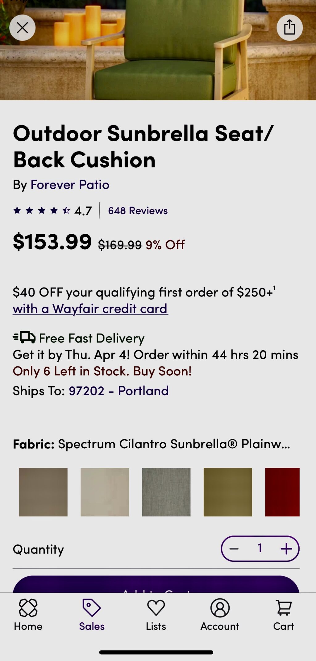
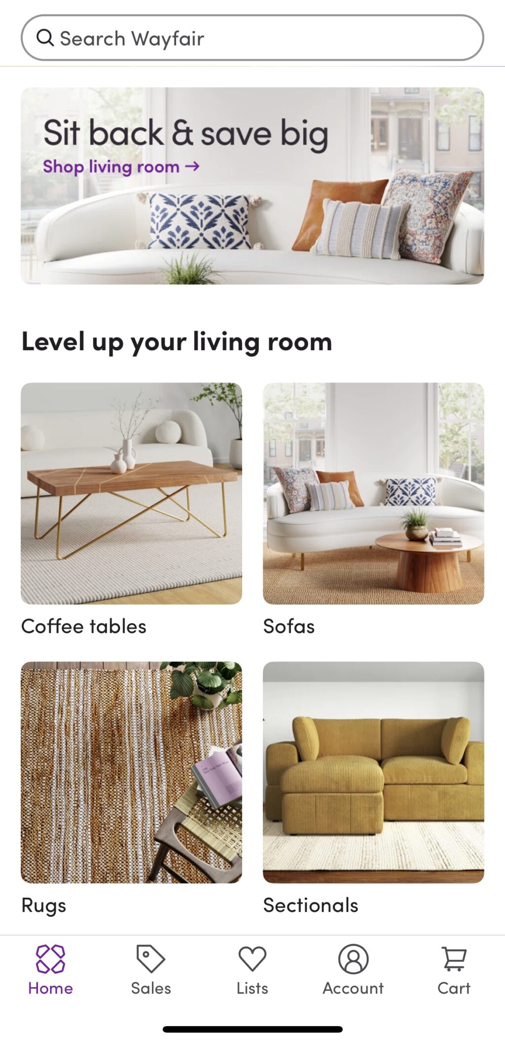
Launching the Wayfair app initially prompts you to sign in or create an account. You can use the app without creating an account, but signing up will give you access to lists, live order tracking, 3D view, and exclusive sales. Like many other furniture apps, navigation is intuitive. The top nav has a search bar, while the bottom of the screen sports icons for home, sales, lists, account, and cart. When viewing the catalog listing page, there are sort and filter options. You can shop by department: furniture, outdoor, bedding & bath, décor & pillows, rugs, lighting, home improvement, appliances, kitchen, baby & kids, organization, custom cabinetry, and pets. You can follow a brand you like or share it like you would a product detail page. In addition to dedicated sales featuring daily deals, you can peruse closeout and open box items for more savings.
We appreciated that the mobile app experience mirrors that of the online website. Product listing pages feature multiple pictures, reviews, price, availability, and arrival dates, available colors, product details, shipping and returns, customer photos, similar items, and “frequently bought together” suggestions. You can share any items directly from the app via whatever method your phone supports (for example, Airdrop, message, or mail if you’re on iOS). And, if you take a screenshot, a popup asking if you want to share the image appears at the base of the screen. If you need help, there’s always a call button or virtual assistant chat button. If there’s something special to note about a product on a catalog page, like fast shipping, or if it’s on sale, that’s also pointed out.
More to see: 3D & videos
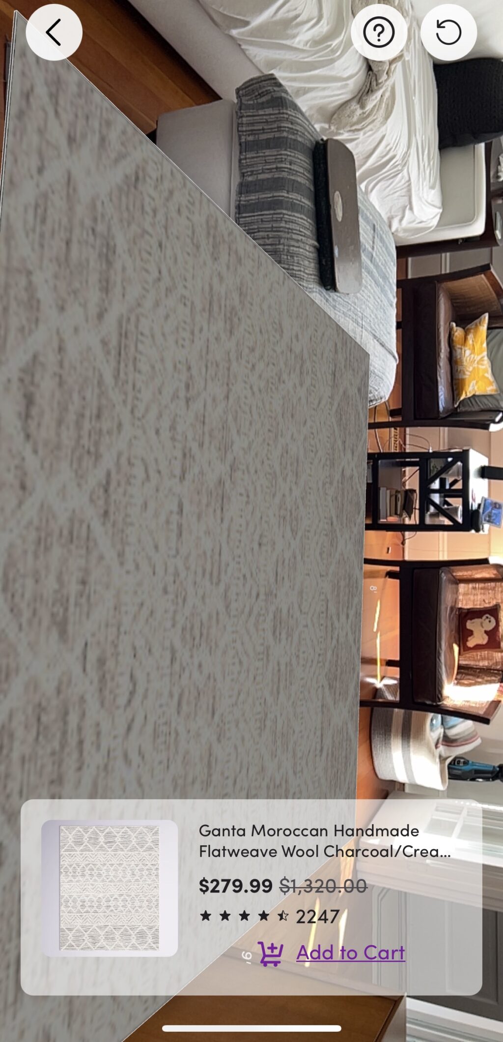
Like other apps in this roundup, the Wayfair app features the ability to view items you’re looking at in your room. You’ll need to create an account and give the app access to your camera to access this feature. Products that you can see in your home will have an icon on the category listing that looks a bit like a snowflake. Click that icon, and the app launches your camera app. Directions on the screen prompt you to move the device around the room, and soon, you will see an overlay of the item you’re viewing in the room. Place it where you want and click the Tap to Place button.
It sounds simple enough to use, but the experience is definitely lacking. We tried viewing a rug in our living room, and all we could see was the rug. The image removed everything else in the room so that we couldn’t picture it in our room.

If you’re interested in seeing products in action, visit the “Shop While You Watch” page, which you can access by scrolling to the bottom of the homepage. This option is an organized feed of all the company’s Instagram videos. Check out videos that show off décor, how to use items, and more. The video collection covers various categories to accommodate just about any searcher’s needs: appliance upgrades, pets, Wayfair exclusive brands, seasonal, outdoor, and, of course, by room.
Final takeaway for Wayfair mobile app:
The Wayfair app isn’t all that different from the online shopping experience. Creating an account unlocks more features, like lists and seeing items in a room. We wish the latter experience were better.
#6 American Furniture Warehouse Visualizer
The American Furniture Warehouse Visualizer mobile app (iOS and Android) is loaded with features that can help you see a product from every angle and picture it in your home.
Pros:
- Plenty of navigation tools
- Interactive 360-degree photos
- Useful suggestions for products that go with an item
- Easily add photos of AFW products in your home
- Simple share options
Cons:
- Shop a look could have more product detail options
- The AR feature wasn’t working
Features:
- 3D room planner (but can’t access in the app)
- AR visualizer for placing objects in your space
- Shop in app
- Multiple product images
- Barcode scanner
- 360-degree photos
- Account access
- QR code scan
- Product suggestions
- Email to a friend
- Add photos to a gallery
Categories: Furniture and décor for inside and outside the home
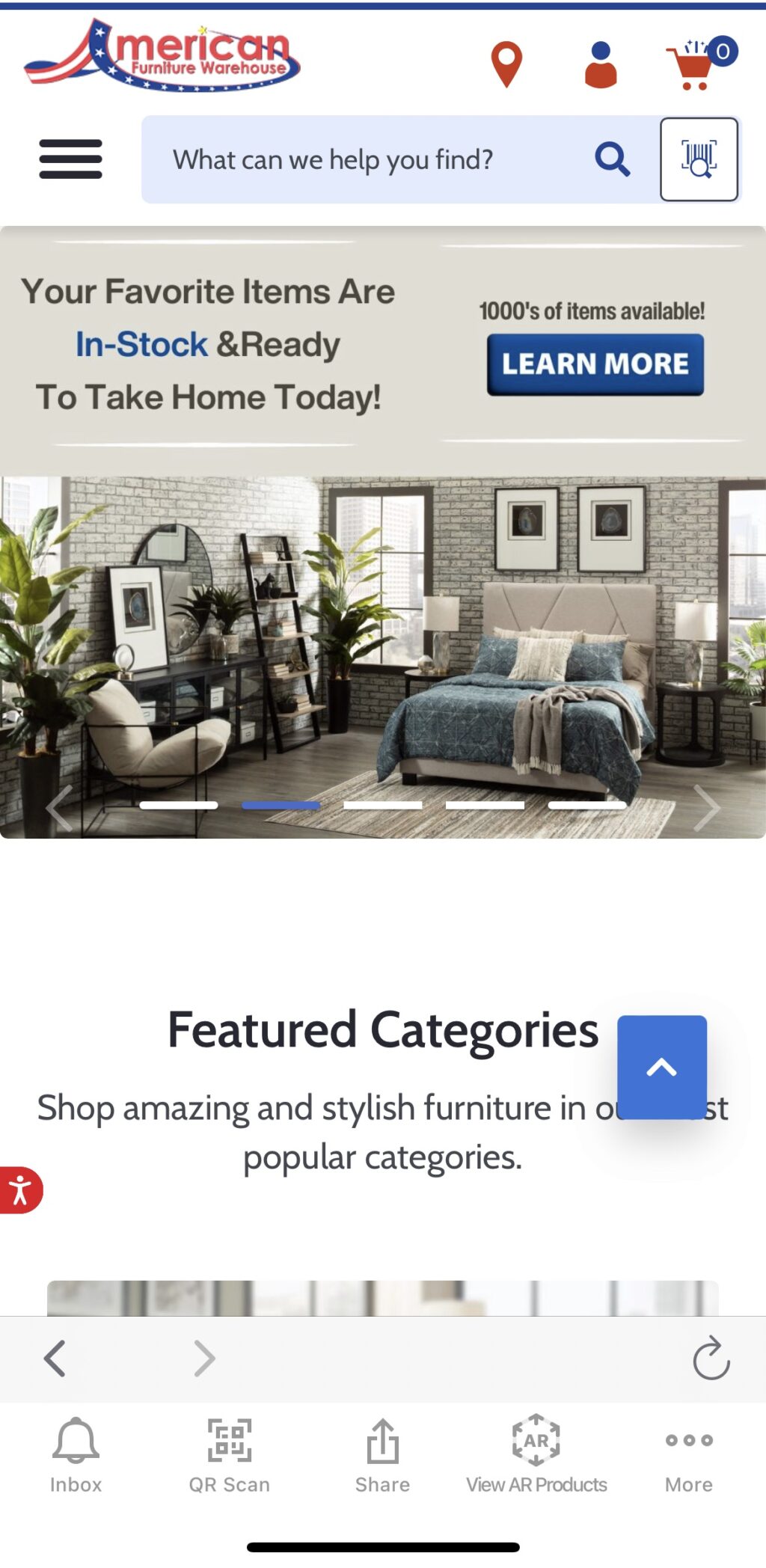
The app’s interface is colorful, highlighting the red, white, and blue color scheme synonymous with the American flag. The top navigation has a hamburger that lists categories (home, furniture, sleep center, home décor, what’s new, inspiration, resource, about us, and planner), search, barcode scanner that you can use in the store, account access, location, recently viewed product, track your order, and help center. The bottom nav sports icons for inbox, QR code scan, share, view AR products, and more, which takes you to account settings. We particularly appreciate the arrow keys and back icon for easy navigation within the app.
The inspiration category is all about shopping for the look. If you want to shop the look, click on it, and it will load the inspiration image with a few items from the picture but not all. For example, Cozy Living Room had a few accessories but no furniture. We wish it had many more options, as that would be helpful for people looking for some guidance on what will work in a room.
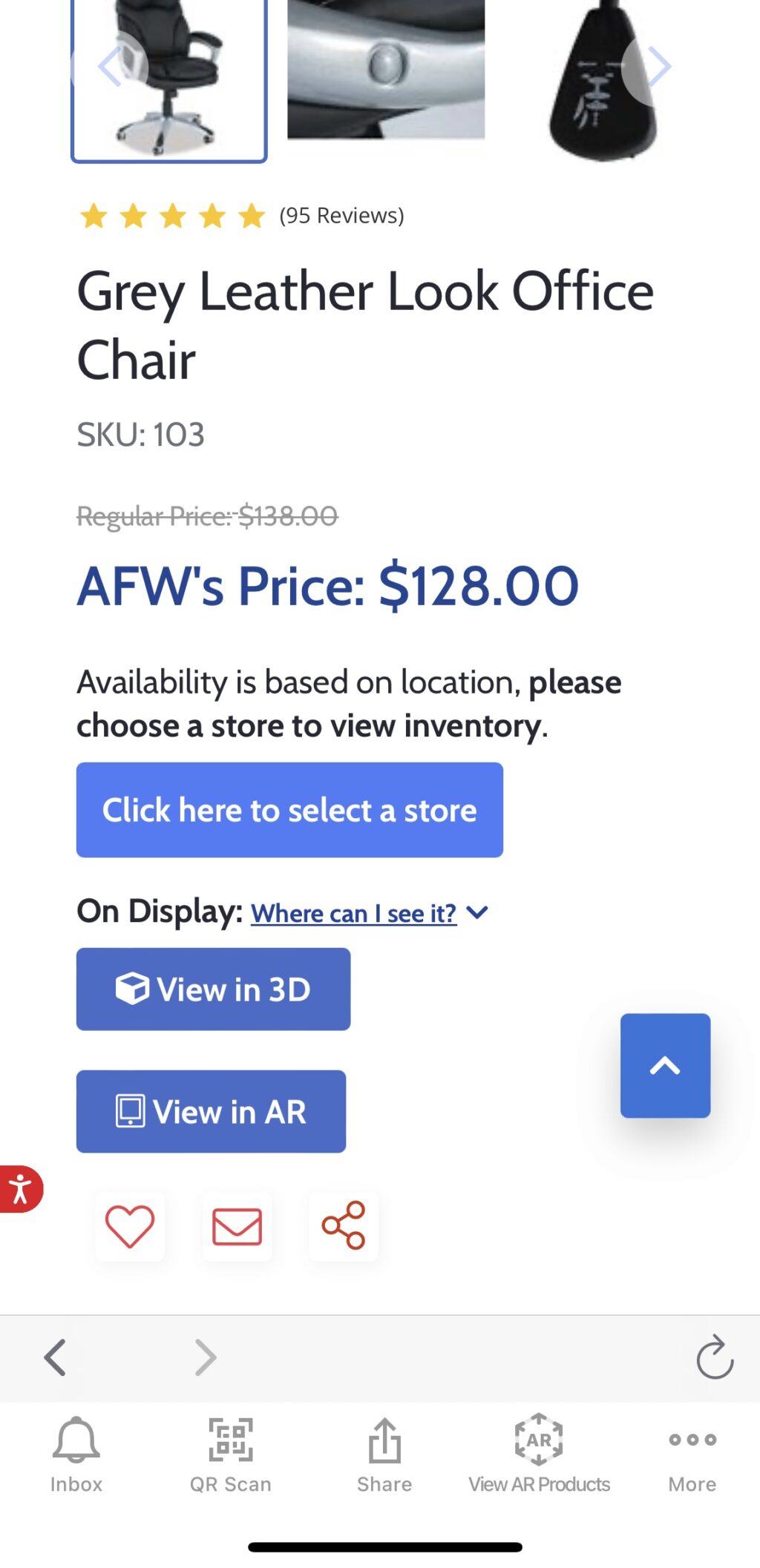
Products are listed in a single view. They include an image, product name, reviews, price, favorite, and, if it’s supported by AR functionality, a View in Room banner (see more below). The product detail page includes everything in the list tile, plus multiple images (with zoom), availability, description, specs, similar items, share (this doesn’t seem to prompt any action), email, and expanded reviews. If you interact with an image enough, a style button appears that, when clicked, will list options that will work with it. For example, when looking at an office chair, our style options included a rug, desk, small couch, storage items, etc. If you do purchase a product, once you set it up, you can easily snap and share photos of your completed look in the app.
Spinning and placing furniture: hit or miss
Some products also have a 360-degree option that displays the product from multiple angles. Click the image, and the item appears with navigation arrows so you can turn it at will. When clicked, an extended menu provides options for dimensions and angles, as well as download as a PNG and expand. You can also tap and hold the image and spin it in any direction.
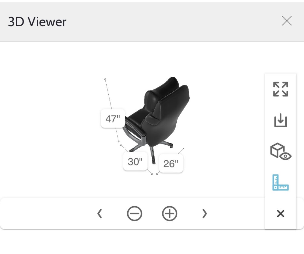
The View in AR feature should work like others in this roundup — scan the room, a product image will appear, and you can place it. Unfortunately, we couldn’t get it to work, and we tried multiple products. However, we did appreciate that only products that support this feature are easy to find with either a click for a complete list or a banner on the image.
Final takeaway on American Furniture Warehouse Visualizer mobile app:
The app has a lot to offer. Unfortunately, some of the exciting features, like the AR view in a room feature, didn’t work for us, and the room planner option is only available for use on a computer or tablet. That said, what worked really well was the view in 3D.
#7 West Elm Mobile App
The West Elm mobile app (iOS and Android) doesn’t have many extra features, like the ability to view a room, but it is relaxing to look at.
Pros:
- Shop rooms
- Can favorite items without creating an account
- Registry
- Free design services
Cons:
- No advanced features like AR or 3D images
- Not all products in a room are on the shop category listing page
Features:
- Shop in app
- Multiple product images
- Access account online
- Favorites and lists
- Shop rooms
- Registry
- Free design
- Personalize shopping with an account
Categories: Furniture and décor for inside and outside the home, and small kitchen appliances
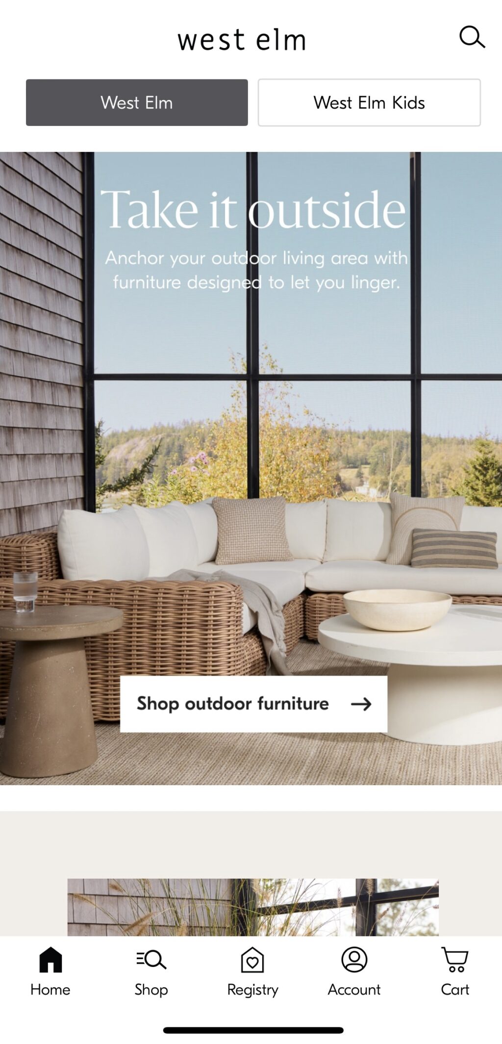
Similar to the Crate & Barrel mobile app, when you land on the home page of the West Elm App, you scroll up and down to view beautiful photographs that capture each category. On the top nav, there’s a search bar and an option to stay in West Elm or click a button and view West Elm Kids, which has the same functionality, only tailored to kids’ furniture. The bottom nav bar has icons for home, shop, registry, account, and cart. When you’re on a product detail page, the bottom navigation options disappear, and you’ll need to click the back button on the picture to return to a listings page. The setup is intuitive enough, but it’s a departure from what we’ve seen on other apps and worth a mention.

The main categories on the home page, which probably change by season, include outdoor furniture, planters, pillows & décor, and looks by room. The remaining sections are furniture, outdoor, rugs, bedding, bath, lighting, pillows & décor, windows, art & mirrors, kitchen & dining, storage, gifts, holidays, sale, collaboration, trending styles, and shop rooms. Click on one of those options to find a listing of goods. Click on one of the items, and you’ll find product detail pages that feature multiple images, options (fabric, wood, color, etc.) or delivery and pickup choices, quantity selection, dimensions, assembly & care, shipping & returns, people also browsed and bought, recently viewed, share (using your phone’s sharing methods) and relevant images from the company’s #mywestelm Instagram feed.
Registry and shopping
When you shop a room, most items are in the product listing, but not all. Like other listing pages, you can favorite items and see available colors, pricing, if it’s on sale, some dimensions (when useful), and free shipping when available. If you need help, you can always request a free appointment to meet with one of their designers.
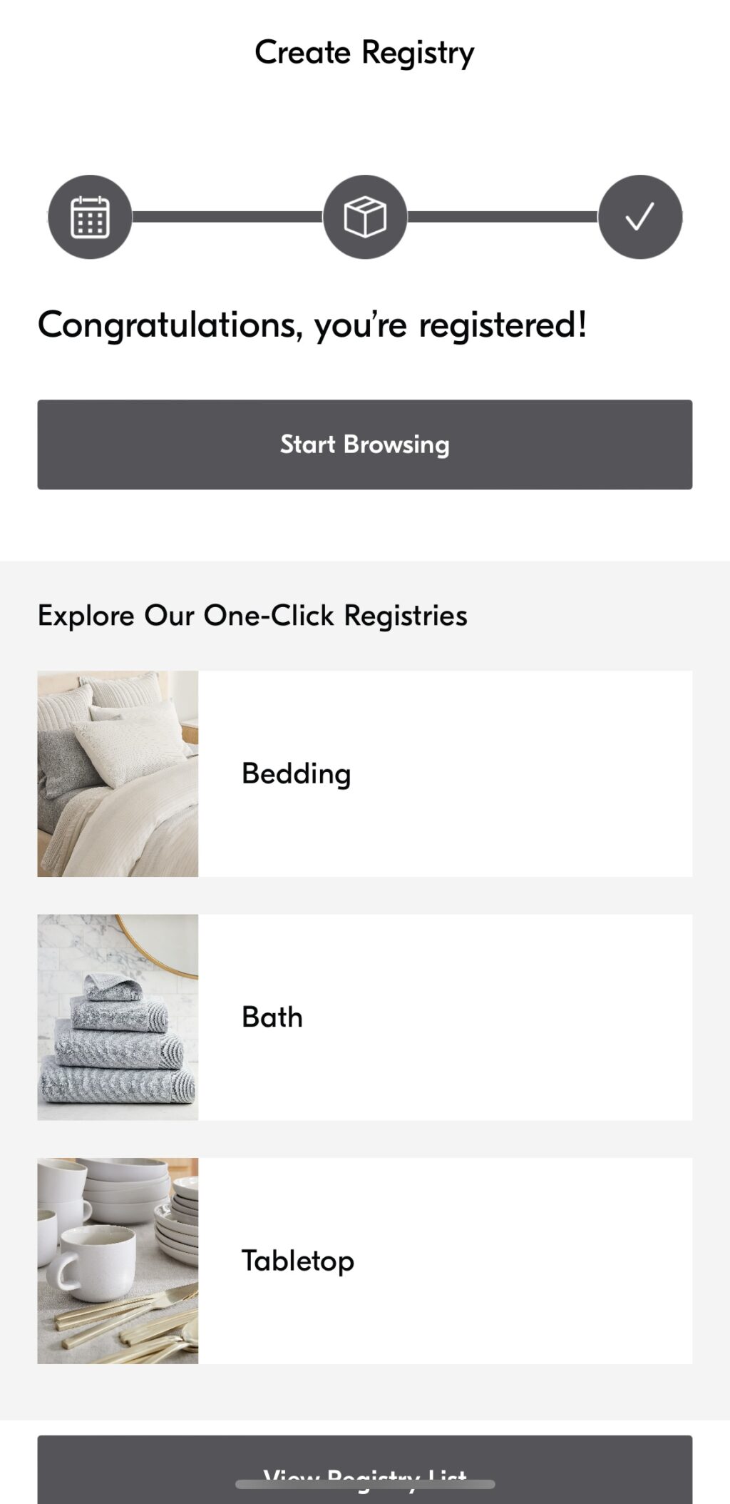
While you can peruse the app and even favorite items without creating an account, you must make one or sign in to use the cart or set up a registry. If you’re looking to create a registry, create an account first, as that section of the app assumes you already have one and doesn’t give you the option to sign up. The good news is creating an account requires far less information than other apps in this roundup. All you need to enter is your email address, name, and password. Setting up the registry includes selecting an event, adding a shipping address, and where to ship your goods. Then, start shopping, and instead of adding an item to a cart, you add it to your registry.
Final takeaway for West Elm mobile app:
The West Elm app gives us the same feeling as going into a brick-and-mortar store—nothing is crowded, items are pretty to look at, and we leave with a good idea of what we want to buy. If you want to see how these items look in your home first, you’ll need to make a purchase.
#8 ZARA Home mobile app
ZARA Home is the app (iOS and Android) you’d find yourself scrolling through on vacation, with its beautiful photography, lifestyle scenes, and editorial content.
Pros:
- Lots of categories
- Easy to navigate
- Visually appealing
Cons:
- No advanced features like AR or 3D images
- Not all products in a room are included on the shop category page
Features:
- Shop in app
- Multiple images
- Access account online
- Favorites
- Shop rooms
Categories: Furniture and décor for inside and outside the home, and pets
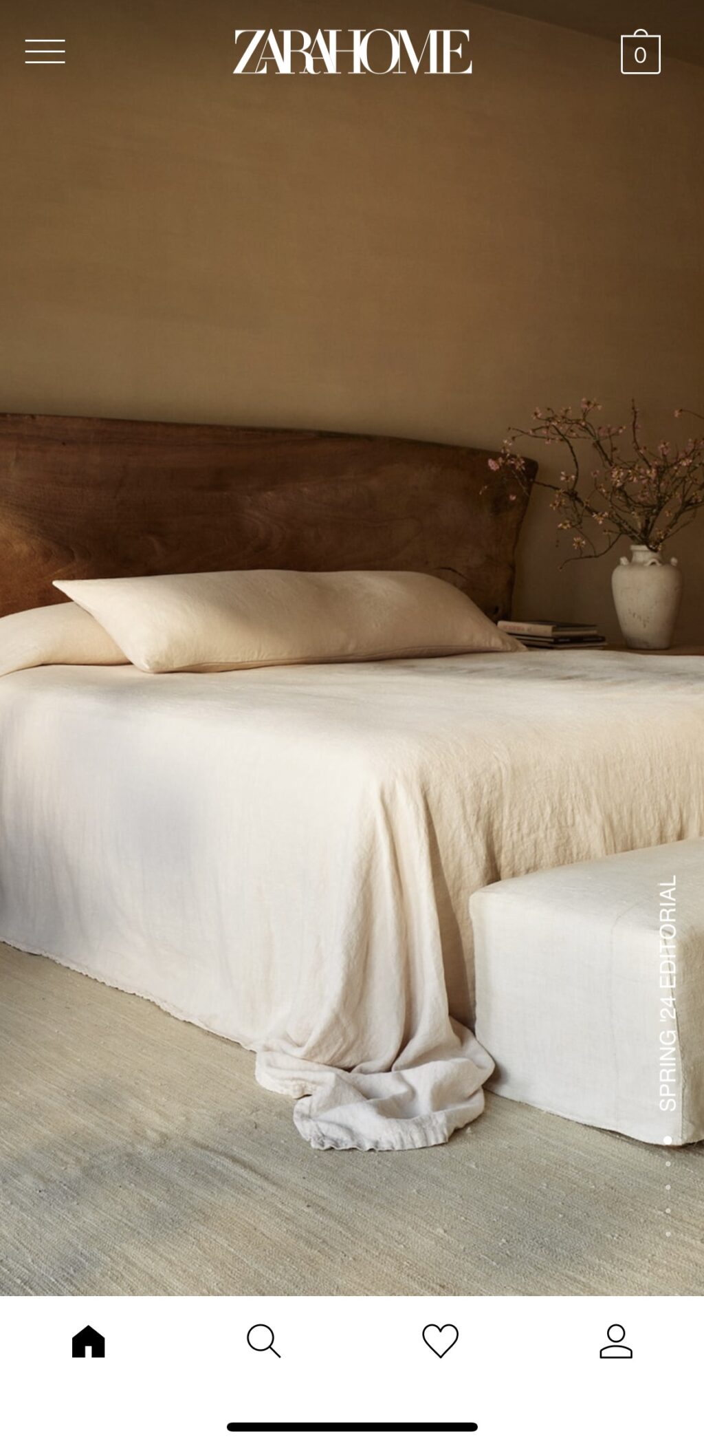
One of the more design-forward apps, the home page cycles through hero shots of furniture or lifestyle scenes. You can always scroll up if you don’t want to wait to see the image. On the top right corner is a shopping bag. The bottom nav has icons for home, search, favorite, and account. You can create a new account by signing in with your Google, Apple, or Facebook IDs.

Navigation is fairly straightforward and needs to be with the number of categories. Tap the hamburger icon in the opposite top left corner. You’ll see an array of options: New in, beach, bedroom, loungewear & shoes, live & lounge, furniture, dining, kitchen, bathroom, fragrances, kids, newborn, permanent collection, linen collection, pets collection, home office, personalization, special prices, Vincent Van Duysen, editorial (where you’ll find recipes, music, and images of their new collection), and join life (discusses the company’s sustainability efforts and materials they use to create goods). Most of those categories have a long list of subcategories.
When you click on a category (tables), you can scroll through an image stream that states the name and price. Filtering furniture manually or use the more high-level subcategories (side tables, coffee tables, dining room tables, etc.) listed at the top of the screen. Click on a product, and the bottom nav disappears to provide relevant details like dimensions, price, availability, materials, shipping and returns, and support. You’ll also find similar suggestions and products. You’ll need to swipe up and down to see more images of an item. Swiping left to right leads you to the remaining products in the category.
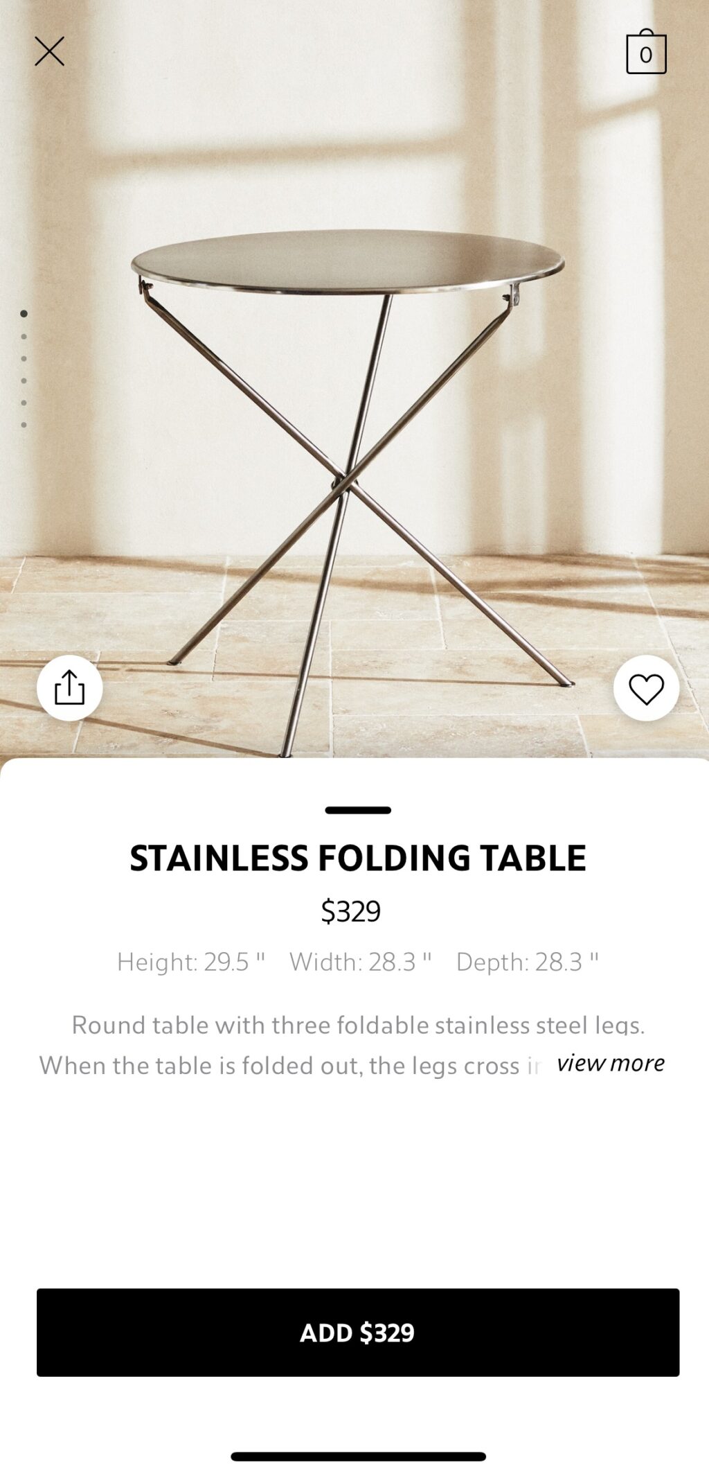
Final takeaway for ZARA Home mobile app:
What the ZARA Home app lacks in features, it makes up for in design and additional content. The entire experience feels like looking at a glossy magazine, and some days, that’s exactly what you want to do.
#9 Rooms To Go mobile app
The Rooms to Go app (iOS and Android) may not have many bells and whistles, but it does a good job of presenting the necessary details to help you make a buying decision.
Pros:
- Straightforward navigation
- Favorites
Cons:
- No advanced features like AR or 3D images
- Need to enter your zip code or city to enter the site
Features:
- Shop in app
- Multiple product images
- Access account online
- Favorites
Categories: Furniture and décor for inside and outside the home
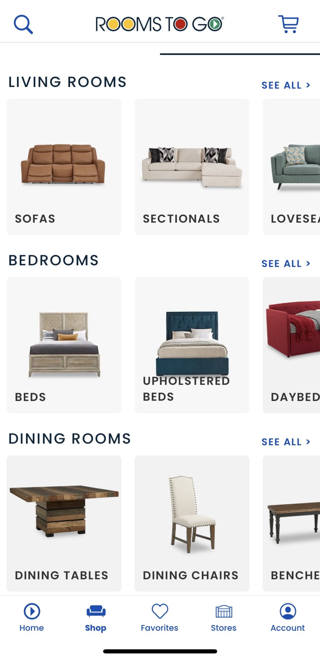
Like the Ashley Furniture mobile app, you’ll need to designate your location (or allow the app to access your location) before entering. That way, you’ll know immediately if a product can be professionally delivered and set up in your area. Rooms to Go sports all the basic features found in furniture apps: filters, sort, purchase in app, account access, product details, and favorites. You can also shop by item or buy room (the idea is to buy a set and drill down to subcategories for even more filtering. For mattresses, you can shop by brand.

The site has a clean look: product lists include a large image, color options, product name, favorite, and price. If financing is available or if it’s on sale, you’ll see that, as well. Product detail pages include all the above, plus an overview, dimensions, if it can be delivered to your location, add to cart, real photos from real customers, and recently viewed products. Navigation is simple: There’s a search bar on the top nav and a cart icon; on the bottom, there’s a home, shop, favorites, stores, and account icons that take you to those places on the site, respectively.
Final takeaway on Rooms to Go mobile app:
This basic furniture app lists a lot of inventory in an uncluttered and unfussy manner. You won’t find many extra features, but you may not miss them.
#10 Bed Bath & Beyond (BB&B) mobile app
You might not have expected to find this furniture app in this roundup with the closure of all its stores. However, Overstock.com acquired the intellectual property of BB&B and rebranded itself as Bed Bath & Beyond in August 2023. The resulting Bed Bath & Beyond mobile app (iOS and Android) mixes what both companies have offered but lacks advanced features like “view in a room” and 360-degree views of goods.
Pros:
- Coupons and discounts
- Can change how you view items
- Buy everything in a room
- Favorites and lists
Cons:
- It’s not clear who is fulfilling the purchase
- Need to create an account to unlock more features
Features:
- Coupons
- Shop in app
- Multiple product images
- Access account online
- Explore
- Favorites & Lists
- In-app discounts
Categories: Furniture and décor for inside and outside the home, hot tubs, and kitchen appliances (big & small)
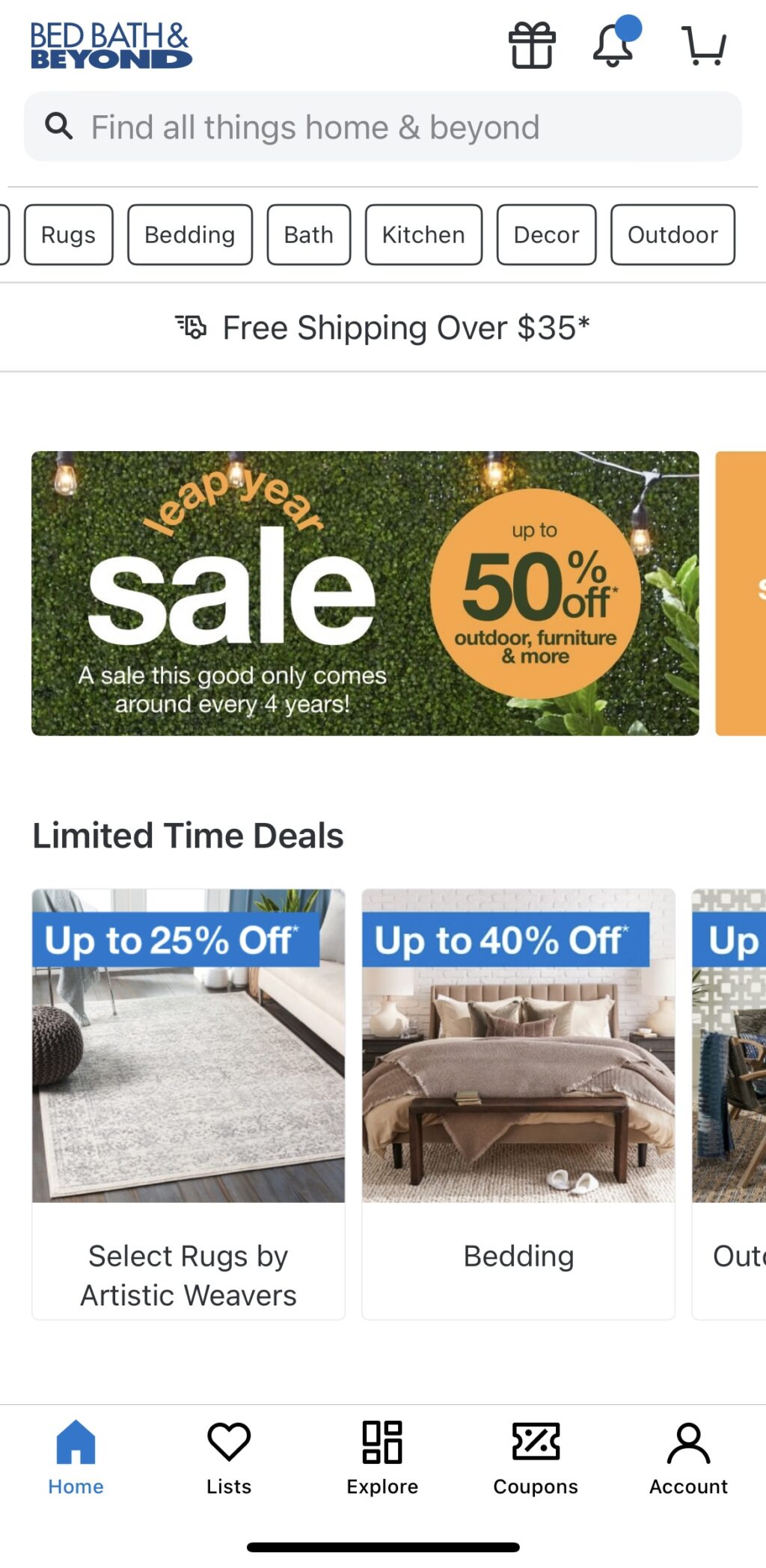
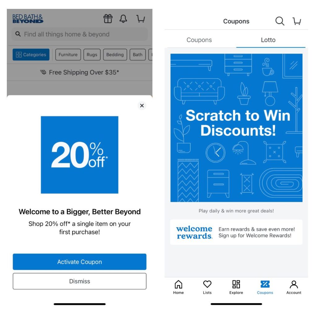
The Bed Bath & Beyond mobile app has many products and does its best to present it in an organized manner. You can shop by product, room, style, or picks from Brand Ambassadors. You’ll first notice that everything is either a percentage off or has a red sale price. Discounts are a big part of the experience. Upon initially opening the app, it walks through options (tracking, creating an account, etc.) that all promise to deliver even more discounts. You can still use the app even if you opt out of all those features… and even get additional savings. Click the coupon icon in the bottom nav bar, and you’re taken to a spot where you can activate any you click while navigating the site. There’s also a Lotto option that presents a new deal daily. We scratched and got an offer for $20 off a $150 order.
Like many other furniture sites, it offers everything from bedding to living room sets to patio furniture. It also offers many other items inside and outside the home, such as kitchen wares, bathroom supplies, hot tubs, and fire pits. Product detail pages are reminiscent of ones you might find on Amazon, complete with product details (price, color, specs), a carousel comparing similar items, shipping details, reviews, questions and answers, similar items, and “frequently bought together” suggestions.
What you won’t find is any interactivity. You can’t view a product in a room or spin it 360 degrees to see it from multiple angles. You can, however, change how products are displayed (grid, list, or gallery) by clicking the square next to the search bar at the top of the screen. Tap the square, and the icon will change to an outline of the display option you choose (four squares for the grid, one square for the gallery, etc.), and product listings will match that view.
The bottom nav also has an Explore icon where you can view a picture of a room and then see all the products in that room—a nice feature for shoppers who aren’t entirely sure what to include in a space. If you’re buying big-ticket items, like a sofa, there’s an option to add a protection plan, though there’s not a lot of information about who is fulfilling the sale.

Final takeaway for Bed, Bath & Beyond (BB&B) mobile app:
There are a lot of things you can buy on this app and at a discount. There are so many special offers and coupons on the site that you can’t help but wonder how good this deal is. Product detail pages are similar to Amazon, and while they have a lot of pictures, they lack any virtual interactivity with goods.
The bottom line on furniture apps
In our testing, the apps at the top of our list far outshined the ones toward the bottom. The top two furniture apps—from Ikea and Ashley Home Furniture—featured smooth interfaces, easy navigation, and powerful use of 3D and AR.
This advanced technology enables shoppers to visualize how new furnishings will look in their homes before making a purchase. The best apps, especially those two, combined with intuitive interactivity, extensive product inventories, and impressive visualization. They provide a powerful tool for savvy shopping.
Learn how WebAR with 3D Cloud can boost your company’s furniture sales
Furniture retailers face a highly competitive market, and WebAR can provide the edge you need to win consumers. Existing customers know what they’re looking for and can use the limited AR experience in a mobile app to complete a picture for them. That’s not the case for new customers. If you want to attract new shoppers, consider adding WebAR to your online furniture experience. The bigger screens on tablets, laptops, and computers give potential customers a much larger canvas to envision how big furniture pieces will fit in the room, making them more likely to purchase. For example, when Jerome furniture customers use AR, there’s a 300% increase in conversion and a 25% higher basket size.
Adding a WebAR experience to your site doesn’t have to be overwhelming or take a lot of time. With our extensive experience in AR, VR, and 3D, we can vault your brand into the future with a solution that will wow consumers and persuade them to purchase your products. 3D Cloud can create your furniture app and help you beat your competition. We’ve built 3D furniture apps for companies big and small, including Ashley Home Furniture.


